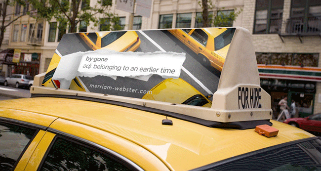
Mike is a new art director and recent VCU grad. The typography throughout his portfolio is subtle and beautiful (great use of white space), which makes the lines sing. Love seeing an AD start off his book with a campaign for Merriam-Webster. High-five, Mr. Lee.
Portfolio: bookofmikelee.com
