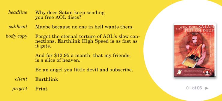
Lissa is a copywriter/CD/SVP at Tajima in Los Angeles. One of the interesting things about looking at copywriter sites is checking out the presentation of work, especially print. How do you make small type readable? Do you zoom into the ad? Show a window off to the side? On Lissa’s site, it’s all about the writing. Copy is presented huge. Layouts are tiny.
Portfolio: walkercopywriting.com
